StudentShare
Contact Us
Sign In / Sign Up for FREE
Search
Go to advanced search...
Free

The Guardian Typography - Case Study Example

Cite this document
Summary
The paper “The Guardian Typography” looks at one of the famous and respectable British daily newspapers, which generally covers news about politics, economics, culture, foreign news, producing the impression of unbiased reporting. Today every printed media tries to form its own specific image…
Download full paper File format: .doc, available for editing
GRAB THE BEST PAPER96.2% of users find it useful
The Guardian Typography
Read Text Preview

Extract of sample "The Guardian Typography"

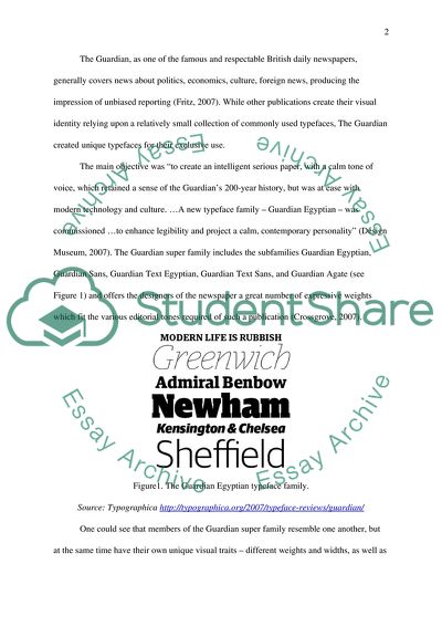
Portfolio The Guardian typography Today every printed media tries to form its own specific image or visual identity which includes some characteristics, helping to achieve an attractive appearance and to distinguish it from its competitors. Typography is counted as one of the most essential elements of corporate visual identity (CVI), mainly because it helps organisations to communicate with their target audiences successfully and provides recognisability (Van den Bosh et al. 2005). “Typography is the considered arrangement of letters and words that conveys information and meaning. …Typographic communication can inform, document, persuade, entertain, or edict a response. The visual form typography takes can help gain attention, make an impression, and signal intent” (Byrne, 2004, p.2). The main elements of typography are type and typeface. Typefaces distinguish between each other by their feet and curves. So, one of the major typefaces – Serif (e.g. Times New Roman) has feet and curves, it is considered as formal, classic, confident and calm. Serif typefaces are considered as more readable, especially in small sizes, and flexible to put in paragraphs, so designers of magazines’ articles often use such typefaces. Another typeface Sans Serif (e.g. Arial) looks more clear and structured, has straight or slightly curved lines and don’t have feet. (Bernard et al., 2002; Lund, 1997). Typographic communication requires the reader to translate symbols into meaning. So, important characteristics of a typeface are legibility (or visual perception), which refers to how easily this process is performed (Watts and Nisbet, 1974) and readability, which describes the quality of visual comfort – an important requirement in the comprehension of long stretches (Tracy, 1986). These two aspects of a type are fundamental to its effectiveness; typographers aim to achieve excellence in both. The Guardian, as one of the famous and respectable British daily newspapers, generally covers news about politics, economics, culture, foreign news, producing the impression of unbiased reporting (Fritz, 2007). While other publications create their visual identity relying upon a relatively small collection of commonly used typefaces, The Guardian created unique typefaces for their exclusive use. The main objective was “to create an intelligent serious paper, with a calm tone of voice, which retained a sense of the Guardian’s 200-year history, but was at ease with modern technology and culture. …A new typeface family – Guardian Egyptian – was commissioned …to enhance legibility and project a calm, contemporary personality” (Design Museum, 2007). The Guardian super family includes the subfamilies Guardian Egyptian, Guardian Sans, Guardian Text Egyptian, Guardian Text Sans, and Guardian Agate (see Figure 1) and offers the designers of the newspaper a great number of expressive weights which fit the various editorial tones required of such a publication (Crossgrove, 2007). Figure1. The Guardian Egyptian typeface family. Source: Typographica http://typographica.org/2007/typeface-reviews/guardian/ One could see that members of the Guardian super family resemble one another, but at the same time have their own unique visual traits – different weights and widths, as well as both serif and sans serif variations. It helps designers to exhibit distinctive styles of newspapers’ sections: review, sports, financial, editorials, sometimes taking advantage of the tranquil thin weights, sometimes picking up the punch of the black colour, sometimes utilizing the decorative feel of the italics. Thus, sports results in 5 and 6 point, financial reports and headlines as large as 400 points, and column headings in a variety of weights - all retain the lively yet neutral feel of the base design (Crossgrove, 2007; see Figure 2). Together with a five-column layout it appeared to become an effective way to enliven the publication and draw readers, at the same time answering the requirement of legibility and readability. Figure 2. Examples of pages and columns design. Source: Typographica http://typographica.org/2007/typeface-reviews/guardian/ The Guardian team has achieved a remarkable result in the management of the organisations current corporate identity via the re-design of the newspaper, and creating of the new typography in particular. The new design has eventually come to represent organisation and it is considered the important step towards building a corporate reputation, which is influenced by all of the elements in the corporate identity mix: behaviour, communications and symbolism (Van Riel and Balmer, 1997). Corporate reputation refers to the distinctive attributes of the organisation (Van den Bosh et al., 2005). In the case of the Guardian the typography has become one of the major distinctive attributes not only of new image of the newspaper, but of the corporate visual identity at a whole. In this respect, it is remarkable that the new Guardian typefaces have become using not only within the newspaper’s columns, but also within the corporation – in documents and in office interiors (see Figure 3). Figure 3. Guardian News & Media Wayfinding. Source: http://www.flickr.com/photos/septemberindustry/sets/72157610505989237/ Portfolio 2. The IKEA colours. Colours have a great impact on the overall branding of an organisation; a lot of companies build their visual identity using specific colour schemes. One of such companies is IKEA. Currently IKEA is a global furniture brand, the company that specializes in modern, simplistic furniture with clean distinctive lines. The most remarkable feature of the IKEA’s corporate philosophy is a strong relation to Swedish heritage and traditions, as well as values of its founders. The company was founded in the 1940s by Ingvar Kamprad who was born in Smaland in Southern Sweden. The name IKEA is formed from his initials (I.K) and the first letters of Elmtaryd and Agunnaryd - the farm and village where Ingvar grew up. The IKEA logo was designed in 1943 in blue (Pantone 293) and yellow (Pantone 109) colours1 (see Figure 4). Van Reil and Fombrun (2007) assert it was no accident that blue and yellow colours were chosen for the brand colour schemes. The IKEA concept, like its founder, was also born in Smaland, where people are famous for working hard, living on small means and using their heads to make the best possible use of the limited resources they have. This way of doing things is at the heart of the IKEA approach to the business. So, it is not surprisingly that the colours of the Swedish national flag have become the colours of IKEA. Lisa Abend from the Time points out: “Branding has been a large part of the Swedish chains success — what urban dweller today, whether in Atlanta or Kuala Lumpur, doesnt recognize that bright blue warehouse, glowing like a beacon of fine living, at the side of the highway?” (2009). More than 60 years IKEA successfully flourishes under the yellow and blue colours of Sverige, appearing to be forever Swedish and demonstrating the psychology of corporate branding, namely how colours can help to produce certain feelings in consumers and the public. Figure 4. IKEA colours. Undoubtedly, a long history of logo and a strong association with the same colours have played a big role in providing of the corporate visual identity of IKEA. But the blue-yellow combination itself appeared to be a significant factor in the process of securing the company’s position in the market. Sassoon (1992) discusses the relationship between colours and social matters and argues that the colours that identify a certain artifact or an organisation reveal often some implicit categories of values. He says that a long tradition ties colours to ceremonial rules, customs, social roles, and largely determines their process of signification. “The burden of values that weighs on colours is, after all, centuries old, and it would be illusory to think that we can rid ourselves of it in the space of a few generations (Sassoon, 1992, p.170). In a theory of colour blue and yellow are primary hues, elemental and pure (Carter, 2002). Blue colour is characterised as a colour that transmits sensations of freshness, calm, and peace; at the same time the unbounded expanses of blue deep sea and high sky are analogical terms of a great power. It also accentuates the values of tranquillity, intimacy, and intensity of feelings; blue is an indication of a preference for tranquil, orderly, and trouble-free environment in which events proceed softly, along more or less traditional lines. This colour has always been connected with royalty and nobility (“blue blood”), fundamentally it is considered as a conservative colour (Sassoon, 1992). Yellow colour transmits very different and sometimes opposing values. It is close to the optical effects of daylight, so it produces feelings of warmth, optimism and joy. Sassoon (1992) recalls words of the famous artist Kandinsky, who asserted that, contrary to blue, yellow colour gives the impression of closing in. It is always associated with gold and prosperity, as well as with intellect and goodness. Yellow colour is active, orientated optimistically towards the future. Combination of pure blue and yellow colours is attractive to the majority of customers, because these are colours of nature in a bright sunny day – gold sun on a blue calm sky background. Designers consider this combination to be suitable for companies with a big heterogeneous auditorium, where there are customers with traditional views on life and more liberated public (Snell, 2009). It is an ideal combination for a global retail chain, and IKEA’s experience corroborates brilliantly this assertion. Undoubtedly, fortune smiled on the company when it decided to choose blue and yellow as corporative colours. Portfolio 3. The FedEx logo Marketing gurus urge organisations to “brand” their businesses with a well-designed logo and a set of consistent marketing tools (Olins, 1989). A logo is a unique visual image that represents an organisation (or a company and its products) and aims to create positive and memorable impression in the minds of the people who see it (Olins, 1995). Snyder (1993) suggests seeing logos as a company’s signature on its materials for the sake of corporate identity. Some of the benefits of a professionally designed logo and identity system are (Wheeler, 2006; Rowden, 2004; Gary et al., 2003): Brands the organisation and helps to build the organisation’s identity. Gives stakeholders (customers, sponsors, employees, etc.) a sense of stability of the company’s business. Conveys the reputation of the organisation, shows that the organisation is committed to both its business and to its customers. Makes the organisations more memorable. Graphics associated with the organisation helps them to be at the forefront of potential client’s minds when they need goods or services, which the organisation provides. Differentiates the organisation from its competitors. A well-designed logo can tell the story about how the company conducts its business, including the special practices that make it stand apart from the competitors. A convincing example of well designed logos is the logo of The Federal Express Corporation, which deals with overnight courier, ground, heavy freight, document copying and logistics services. Henderson and Cote (1998) give some important features, according to which organisations can select a good logo. We will try to evaluate the FedEx logo by their guideline. First of all, logos should be recognizable. Recognition of logo occurs at two levels – consumers must remember seeing the logo (correct recognition) and logos must remind consumers of the company name (recall). To make a logo more recognizable the company was advised to shorten their corporate name and to use it in the logo – FedEx. Since 1997, when the logo was created by Lindon Leader, it has become a highly recognized corporate symbol of FedEx Corporation. Moreover, this image, representing an abbreviation of the company’s original name, is directly connected to the corporation’s name (see Figure 5). Figure 5. The FedEx Corporation logo. The second characteristic of a good logo is affect. Henderson and Cote (1998) assert that positive affective reactions are critical to a logo’s success because affect can transfer from the logo to the company, and evaluation of a logo can affect evaluations of a company. The FedEx logo’s strong lines and massive letters strengthen a perception that the company is reliable, stable, serious service provider, who always carries out commitments in given time with given quality. Letter D and E are pressed against each other so that it gives a sense of sturdiness and close relationship. In addition, the symmetry principle between two parts of the logo of different colors increases positive affective reactions (Bevlin, 1989). Positive affective reactions are also caused by interesting and distinctive elements in logos. In a case of the FedEx logo the “hidden” right-pointing white arrow between letters E and X plays a role of subliminal advertising of the brand, symbolizing speed, activity, progress, connecting, attention to details and thinking. As the logos creator Mr. Lindon Leader once said: “The power of the hidden arrow is simply that it is a hidden bonus. It is a positive-reverse optical kind of thing: either you see it or you don’t. ...On the other hand, if you do see the arrow … you won’t forget it” (The Sneeze web-blog, 2004). It is also important to note that the FedEx has brilliantly manipulated colours to create a distinction between its various operating units, remaining within the single logo design. While “Fed” in all types of the FedEx logo remains purple, colour variations of “Ex” represent different operating units of the corporation (see Figure 6). Figure 6. Different variations of the FedEx colours. Source: http://en.wikipedia.org/wiki/FedEx Since 1997, when the logo was created by Lindon Leader, design of the logo has not been changed with the exception of colour variations. Today the logo has become one of the major elements of visual identity of the FedEx Corporation around the world. In 2003 the Rolling Stone Magazine even ranked it as one of the eight best logos of the past 35 years. At a whole, we can sum up - it is well designed logo, based on principles of symmetry and balance, with good proportions and a minimum of complexity. It demonstrates the main values of the FedEx corporation - simplifying, optimizing, certain, personal, inventive and connecting (Wheeler, 2006). Portfolio 4. The Jubilee Campus – contemporary corporate architecture in the Nottingham University. Today’s corporations, competing in global, open-market economies, increasingly care about their physical appearance. Berg and Kreiner note that “huge amounts of money are being invested in improved corporate “looks”, in terms of slick, stylish corporate buildings, new office lay-outs and decorations, landscape gardening, graphic designs, corporate “uniforms” and colour codes, visual identities, etc.” (1992, p. 41). Physical settings which delineate the organisation as a whole, as experienced by its members and the community, are referred to “corporate architecture” as an element of a corporate visual identity. MacKeith (2005) asserts that architecture possesses a strong potential for symbolic representation, that’s why many corporations intend to strengthen their public relations through their corporate architecture. Buildings may be seen as symbolic artifacts that reflect some basic traits of the organisation inhabiting them. In this portfolio we’ll see the Jubilee Campus of the University of Nottingham as an outstanding example of corporate architecture. To understand better co-dependency between architecture of the Jubilee Campus and the University of Nottingham’s corporate vision characteristics, it is helpful to make a brief overview of the University. Nottingham, one of the most popular university cities in Great Britain, it is a UK Science City, and a buzzing regional capital and commercial centre. The University of Nottingham is ranked in the UKs Top 10 and the Worlds Top 70 universities by the Shanghai Jiao Tong (SJTU) and Times Higher (THES) World University Rankings. It provides innovative and top quality teaching, undertakes world-changing research, and attracts talented staff and students from 150 nations. The motto of the University is “A City is Built on Wisdom”. Twice already in this decade its academics have won Nobel Prizes.2 Thus, it would not be mistake to conclude that the main characteristics the University is proud of are creativity, innovation, competitiveness, knowledge, as well as transparency and flexibility. One could easily reveal all of them in contemporary architectural forms of the Jubilee Campus. The first buildings of Jubilee Campus were opened by Queen Elizabeth II in 1999 on the site of the former Raleigh Bicycle Company factory. It is notable that Jubilee Campus has been constructed around an artificial lake on the River Leen and contains plenty of greenery. The most impressive building of the first phase of the campus is the Sir Harry and Lady Djanogly Learning Resource Centre, the library, which represents an unusual circular building situated in the middle of the lake with only one, spiralling, floor (see Figure 7). Figure 7. The Djanogly Learning Resource Centre Source: http://www.nottingham21.co.uk/build_jubilee_campus_thumbnail.htm The environmentally-friendly nature of the campus and its buildings have been a big factor in the awards that it has received, including the Millennium Marque Award for Environmental Excellence, the British Construction Industry Building Project of the Year, the RIBA Journal Sustainability Award and the Civic Trust Award for Sustainability.3 During the second phase the campus has become even more distinctive thanks to its modern and unique architecture. The culmination of a new campus plan is Aspire, the countrys tallest piece of free-standing art (see Figure 8). Figure 8. The Gateway, Aspire Tower, Amenities & International Buildings Source: http://www.nottingham21.co.uk/build_jubilee_campus_thumbnail.htm The Aspire sculpture is described by the university thus: “It says that we want talented people, wherever they are in society, wherever they live in the world, to aspire to a world class education. It captures the essence of our research across all of the academic disciplines — we aspire constantly to solve problems, devise solutions, improve health, achieve greater understanding, and enrich culture. And it conveys the ambition of our city — which aspires to greater prosperity, more highly skilled and knowledge-based employment, improved educational standards and an excellent quality of life” (University of Nottingham, 2008). Other buildings are no less amazing and unique. International House and the Amenity Building (see Figure 9) have facades in multiple shades of red terracotta whereas the Gateway building (see Figure 10) is covered in galvanized zinc shingles. Figure 9. The International Building. Source: http://www.nottingham21.co.uk/build_jubilee_campus_thumbnail.htm Figure 10. The Gateway building. Source: http://www.nottingham21.co.uk/build_jubilee_campus_thumbnail.htm One could see that these are absolutely fantastic constructions, bright examples of contemporary architecture. Visual images, which they create, are directly refer to such conceptions as innovations, novelty, modern technology, progress, science, and contemporary art – all of what any good university would be happy to connect with its corporate identity. References Abend, L. (2009) The Font War: Ikea Fans Fume over Verdana. Time. [Online] Available from: http://www.time.com/time/business/article/0,8599,1919127,00.html#ixzz0k94hVjEy [Accessed 04 April 2010] Bernard, M., Bonnie, L., Shannon, R., Telia, H., Karen, J. (2002) A Comparison of Popular Online Fonts: Which Size and Type is Best? Usability News, 4 (1), Jan 2002. [Online] Available from: http://www.tbook.it/Usability_News.pdf [Accessed 02 April 2010] Berg, P.O., and Kreiner, K. (1992) Corporate Architecture: Turning Physical Settings into Symbolic Resources. In: Gagliardi, P., ed. Symbols and artifacts: views of the corporate landscape. New York, Aldine de Gruyter. Bevlin, M.E. (1989) Design Through Discovery: An Introduction to Art and Design. New York, Holt Rinehart and Winston Inc. Burne, C. (2004) An Introduction to Typography for Students of Graphic Design. In: Heller, S., ed. The education of a typographer. New York, Allworth Press, pp.2-8. Carter, R. (2002) Digital color and type. Crans-Pres-Celigny, RotoVision Book. Crossgrove, C. (2007) Guardian. Typographica web-blog. [Online] Available from: http://typographica.org/2007/typeface-reviews/guardian/ [Accessed 02 April 2010] Design Museum (2007) THE GUARDIAN Newspaper (1821- ). 25/25 - Celebrating 25 Years of Design. Design Museum, 29 March - 22 June 2007 [Online] Available from: http://designmuseum.org/design/theguardian [Accessed 02 April 2010] Fritz E. (2007) Audience Orientation in News Stories: A Comparison Between The Gardian and The Sun. Seminar Paper. Norderstedt, GRIN Verlag. Gary, D., Chun, R., Vinhas da Silva, R., and Roper, S. (2003) Corporate reputation and Competitiveness. London, Routledge. Henderson, P.W., and Cote, J.A. (1998) Guidelines for Selecting or Modifying Logos. Journal of Marketing, 62, April, pp. 14-30. Lund, O. (1997) Why serifs are (still) important? Typography Papers, 2, pp.91-104. MacKeith, P. (2005) The Dissolving Corporation: Contemporary Architecture and Corporate Identity in Finland. Helsinki, Finnish Business and Policy Forum EVA. [Online] Available from: http://www.eva.fi/eng/index.php?m=7&subm=2&action=1&id=40 [Accessed 05 April 2010] Olins, W. (1989) Corporate identity. Making business strategy visible through design. London, Thames and Hudson. Olins, W. (1995) The new guide to identity. How to create and sustain change through managing identity. Aldershot, Gower. Rowden, M. (2004) Identity. Transforming Ierformance through Integrated Identity Management, 2nd ed. Aldershot, Gower. Sassoon, J. (1992) Colors, Artifacts, and Ideologies. In: Gagliardi, P., ed. Symbols and artifacts: views of the corporate landscape. New York, Aldine de Gruyter. Snell, S. (2009) Colors In Corporate Branding And Design. Smashing Magazine.com. [Online] Available from: http://www.smashingmagazine.com/2009/01/28/colors-in-corporate-branding-and-design/ [Accessed 05 April 2010] Snyder, A. (1993) Branding: Coming Up for More Air. Brandweek, 34, pp.24-28. The Sneeze web-blog (2004) The Man Behind the FedEx Logo. [Online] Available from: http://www.thesneeze.com/mt-archives/000273.php [Accessed 04 April 2010] Tracy, W. (1986) Letters of credit. London, Gordon Fraser Gallery Ltd. University of Nottingham (2008) Unveiled: design for Britains tallest free-standing work of public art. The University of Nottingham’s Press Releases, PA14/08. [Online] Available from: http://www.nottingham.ac.uk/public-affairs/press-releases/index.phtml?menu=pressreleases&code=UNVE-14/08&create_date=18-jan-2008 [Accessed 05 April 2010] Van den Bosh, A., L.M., De Jong, M, D.T., and Elving, W., J.L. (2005) How corporate visual identity supports reputation. Corporate Communications: An International Journal, 10 (2), pp. 108-116. Van Riel, C.B.M. and Balmer, J.M.T. (1997) Corporate identity: the concept, its measurement and management. European Journal of Marketing, 31 (5), pp. 340-55. Van Riel, C.B.M. and Fombrun, C.J. (2007) Essentials of Corporate Communications. Oxon, Routledge. Watts, L., and Nisbet, J. (1974) Legibility in children’s books: a review of research. Windsor, NFER Publishing Company. Wheeler, A. (2006) Designing brand identity. A complete guide to creating, building, and maintaining strong brands, 2nd ed. New York, Wiley. Read More
Cite this document
  • APA
  • MLA
  • CHICAGO
(The Guardian Typography Case Study Example | Topics and Well Written Essays - 3000 words, n.d.)
The Guardian Typography Case Study Example | Topics and Well Written Essays - 3000 words. Retrieved from https://studentshare.org/media/1735548-corporate-identity-and-visual-culture
(The Guardian Typography Case Study Example | Topics and Well Written Essays - 3000 Words)
The Guardian Typography Case Study Example | Topics and Well Written Essays - 3000 Words. https://studentshare.org/media/1735548-corporate-identity-and-visual-culture.
“The Guardian Typography Case Study Example | Topics and Well Written Essays - 3000 Words”, n.d. https://studentshare.org/media/1735548-corporate-identity-and-visual-culture.
  • Cited: 0 times

CHECK THESE SAMPLES OF The Guardian Typography

Website portal creation report

The portal's success depends on a clear, concise and balanced arrangement of the information using the basic tools of design: editorial format, typography and programming technique.... Basically, it is aiming at equipping a student or guardian with enough information to make the decision to study....
5 Pages (1250 words) Assignment

Relationships Are Difficult Because Men and Women Are Inherently Different

Your Full Name Your Your 20 November 2012 Relationships are Difficult Because Men and Women are Inherently Different Relationships between the two sexes are often hard to understand and it is quite a feat for those involved to maintain them with ease.... hellip; It is contended that men and women are different biologically; therefore, it is only but natural for them to have a different approach to relationships....
4 Pages (1000 words) Essay

Pathology and Treatment of Gallstones

GALLSTONES – BHSC 1143 (A research essay on abdomen form and function) Name of Student (author) Name of University (affiliation) Introduction .... The focus of this paper is on an illness or disease of a specific organ of the body, which is the gallbladder.... hellip; A common pathology of this organ is the formation of gallstones....
4 Pages (1000 words) Research Paper

Typographer Matthew Carter

Matthew Carter, ‘born in 1937 in London' [1], is a famous typography designer who has dedicated his life in the development of typography creating a series of fonts that are being used on a daily basis by people around the world.... Carter developed his skills in typography… Moreover, ‘after leaving school, Matthew Carter spent what was intended to be his gap year at the Enschedé type foundry at Haarlem in the Netherlands learning how to making Typographer Matthew Carter Matthew Carter, ‘born in 1937 in London is a famous typography designer who has dedicated his life in the development of typography creating a series of fonts that are being used on a daily basis by people around the world....
2 Pages (500 words) Essay

Land and Water Use in the USA and Other Countries

Apart from streams, rivers and lakes, the underground water resources form the basis of serving around 140 million people in United States, for their drinking water and land use needs.... However, contamination by the manmade activities, as well as, natural sources has changed the… As naturally occurring rock and mineral formation, underground, vary from region to region, the physical and chemical properties of the underground water in such regions change accordingly....
6 Pages (1500 words) Research Paper

The rise of the Islamic State

The group rose as a result of America-led invasion of Iraq in 2003.... Islamic state is believed to be a radical anti-western combative group committed in inaugurating an independent Islamic state in the region (Feldman,… The group's acts have confirmed to be more brutal and effective at controlling territories it has seized. This paper shall candidly explicate how Islamic states are aspiring to use Sharia law to restore Islamic states and the adversities that these states are facing in The rise of the Islamic Islamic s started as Jamaat al-Tawhid wal-Jihad in Iraq....
2 Pages (500 words) Essay

Should Advertising to Children be Restricted in Any Way

This paper declares that many marketing efforts are geared towards advertising to children.... These include ads for products such as food items, toys, games, and other similar products.... The average American child watches about 16,000 television advertisements in a year.... hellip; As the paper, Should Advertising to Children be Restricted in Any Way?...
5 Pages (1250 words) Assignment

Sexuality in Films

… The paper "Sexuality in Films" is a wonderful example of an assignment on visual arts and film studies.... In 'The Children's Hour' there is a vivid illustration of age, gender, and class being brought together with sexuality by the main characters.... Mary Tilford, a student in one of the schools run by two elderly women named Karen and Martha brings about havoc into their lives....
6 Pages (1500 words) Assignment
sponsored ads
We use cookies to create the best experience for you. Keep on browsing if you are OK with that, or find out how to manage cookies.
Contact Us