StudentShare
Contact Us
Sign In / Sign Up for FREE
Search
Go to advanced search...
Free

Human-Computer Interface Design Guidelines - Case Study Example

Cite this document
Summary
This case study "Human-Computer Interface Design Guidelines" presents various interfaces but more emphasis will be more on web site interfaces than the stand-alone software. The interface is key to its success or failure hence web developers put more emphasis on the type of interface they design…
Download full paper File format: .doc, available for editing
GRAB THE BEST PAPER94.4% of users find it useful
Human-Computer Interface Design Guidelines
Read Text Preview

Extract of sample "Human-Computer Interface Design Guidelines"

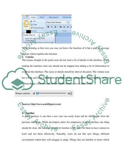
?INTERFACE According to IBM, user interface in are the features that the user can see, touch or talked to which them to interact with the computer. They are the features of a software or a computer (www.-01.ibm.com). User interface is a concept in computer science is under Human Computer Interaction (HCI). This paper focuses on various interfaces but more emphasis will be more on web site interfaces than the stand-alone software. The interface of a website is key to its success or failure hence web developers put more emphasis on the type of interface they design. Since this task is important in software development, experts have agreed on eight most basic characters of a good user interface. While evaluating the interfaces in this paper it will be important to look at these characteristics because they will be the basis of over evaluation. The techniques for interface evaluation among other parameters will be looking at these characteristics. They include: 1. Clear The main aim of any interface to enable users access information and complete their tasks with a lot of ease. Have a clear interface where icons and the menus are well placed and have a clear meaning is important for a successful interface. Users should not be frustrated by the symbols or icons on the interface, one should provide a pop-up message with details of the function of that interface this makes it more clear. While pointing at that icon you may not know the function of it but a pop up message appears which explains the function. 2. Concise This means straight to the point users do not want a lot of details in the interface. While making the interface clear one should not be trapped into adding a lot of information to overload the interface. The icons or details should be short to the point. The volume icon has a scale and icons which shows the high and low volume level. Although it is not easy to keep things, clear and concise developers should strive to achieve this. Sources( http://www.usabilitypost.com) 3. Familiar A good interface is one that a new user can easily learn and be able to use from the previous interfaces. While developers strive for uniqueness in their interface one thing should be clear, the interface should be familiar to the users for them to have interest to learn and use them effectively. Naturally, users do not like new things, different environment which they will struggle to adapt. Things that are familiar or terms which one uses should be familiar to the users of the system. A system that uses icons should be keen on the type of the icons they use because the context of the system is very important. The screen shot below shows the user that he/she does not need to learn more about the interface because these are the tasks that they want to accomplish using this application hence easy to use. Sources ( http://www.usabilitypost.com) 4. Responsive This means that the system interface should be fast, users like an interface that enables them to accomplish tasks within a short period. It is frustrating for users to wait longer as their requests are being loaded slowly. The user should also have feedback from the system such as the percentage of work done by the system, remaining time and completion status either failed or successful. When the program is loading for instance, a progressing bar or a spinning wheel indicates the task status. The program below shows the time elapsed, time remaining and the percentage of the task done. 5. Consistent Users will learn and advance well in their interface usage if the design system is consistent. Having a system with different interfaces for each version of the program disorients the users. The placement of the Icons, tabs and other items on the interface must be consistent. For instance Microsoft interface are consistent for its application package which enables users to easily adapt from one application to another. 6. Attractive Making an interface attractive is important because users will enjoy performing their tasks with it and probably look forward to using the same interface. Having a good interface but poor colours among other aspects of attractiveness makes the interface unsatisfying. Aesthetics are important is fashioning the interface to make it look good and have a good feeling to the clients. Many software or websites are being designed which accomplish the same task as yours but attractiveness will make users have preference to your program. 7. Efficient To be able to accomplish different tasks within a software application or a website, it should be efficient for one to use. Navigating from one place to another in the interface is retrieving different functions of the application package. While designing an interface one should identify key tasks that the user will accomplish. The tasks should be easily accessible. For instance apple with their iphone application identified frequent things that users do with the photos and provided a the buttons for these tasks as shown in the screen shot below. Sources( http://www.usabilitypost.com) 8. Forgiving (handling of user mistakes and errors ) Provisions of how users get out of their mistakes should be incorporated in system interface functionality such as undo or go back to the last known or correct state once they make mistakes. The system should be able to clear handle these mistakes without making the user feel bad about their actions hence encourage learning. Helpful information should be provided to enable the users correct their mistakes. In an input form when the user enters wrong characters the system should provide a meaningful error message. Types of user interface 1. graphical user interface 2. Command line user interface 3. Web user interface 4. Menu driven interface Case study Basing on the above characteristics and the type of interfaces, I would like to evaluate web interface. The main type of web interface I would like to look at is the e-learning user interface to see how users do accomplish their tasks. The techniques detailed below will form the basis of my evaluation where I would like to use cognitive walkthrough and software guidelines evaluation technique will be used. These methods will be used because users and developers are involved in the evaluation who are not only readily available but they are cheap to use compared to experts. Having many evaluators will increase the chances of identifying all the interface problems. The interface to be evaluated can easily be accessed online while students can be used as users of the system. Software guidelines are simple and easy to follow while evaluating the interface hence these two techniques are best suited for this task. Evaluating interfaces The main factors that evaluators look for while evaluating user interfaces include: 1. Language – does the language meet the target audience or if it does convey meaningful message 2. Layout- how your interface is aligned it should be symmetrical 3. Color- the message the colors convey and their contrast 4. Tone and Etiquette- polite message and non-offensive language 5. Special considerations for instance disabilities, features, consistency and standards Techniques of evaluating interface When evaluating interfaces the evaluators examines the usability of the interface, usability is measured in terms of how effective and efficient the interface is. The user satisfaction after using a given system is also a measure of usability (Afonso, A.P., et al., 2011). Interface evaluation is a process that aims at establishing problems of the interface which is a process that requires several activities done. Experts in UI evaluate the interface during formative evaluation (www.cs.umd.edu)There are several techniques used in interface evaluation such as; Heuristic evaluation Software guideline Cognitive walk-through Pluralistic walkthrough Heuristic evaluation This is a technique employed by expertise of the user interfaces, the specialist of the UI evaluates the system in depth whereby they look for properties that they know (Nielsen, J., & Molich, R., 1990) the main issues evaluated are effectiveness and efficiency (www.cs.umd.edu). Given favorable conditions this technique can be effective. However, there are several drawbacks in these techniques. The experts or specialists in User interface (UI) who are support to use this technique to evaluate the system are scarce. Hiring and maintaining such people is expensive for an organization. This evaluation technique must also take place after the interface is in existence therefore their recommendations may come late. Such observations will not be incorporated in the system because the system will have been already designed. These specialists if they are not part of the development team, they may not understand some decisions made basing on the technical limitations. Several UI evaluators should be used but independently. According to Nielsen & Molich (1990), five evaluators come up with 75% usability problems facing that interface. Steps in conducting heuristic evaluation (http://www.cs.umd.edu) 1. Set up heuristic evaluation guideline 2. Seek the services of at least five experts 3. Let each expert carry out evaluation independently 4. Collect and compare individual evaluation 5. If possible conduct a group evaluation with all the experts then compare the results Software guideline To address the above challenges, software guideline was introduced as a technique that allows more evaluators to evaluate the system (Brown, C. M., 1988). Interface designers are given a chance to evaluate their interfaces basing on published guidelines about interfaces. Measures such as color schemes, content of the screen among others are used (Smith, S. L., & Mosier, J. N., 1986). Therefore, the developers of the system are given a chance to give feedback of the system they are developing instead of a specialist who may not be part of the developing team. Cognitive walk-through This is where a learning model is developed and the system testers probably the developers of the system does what a typical user will do in accomplishing their tasks(Lewis, C., & Polson, P., 1990). The evaluation is applicable in design, coding and testing & deployment stage of the interface. The response from the system and the actions are compared to the objectives of the user in terms of accomplishing their task using that interface. Cognitive walkthrough can be carried out by experts of the user interface and the developers. Effectiveness of the interface is the main issue covered in this evaluation. The experts and developers that may be included in this evaluation include; usability experts, software developers, marketers and the people who documented the system. Design stage is best suited for this task. Steps in carrying out cognitive walkthrough task (http://www.cs.umd.edu) 1. Select the evaluators 2. Select the tasks and the interfaces to be evaluated 3. Demonstrate the tasks to the users then let them do it without interruptions Pluralistic walkthrough This is another evaluation technique which takes place in design stage. The evaluators are experts, developers and the users. More emphasis is on the user evaluation because at this stage user evaluators are more than the experts and the developers. In this process the users, experts and the developer meet as a group then one person leads the group by showing them interfaces where they note down their observation. A discussion follows this demo where the evaluators express their concerns. Conclusion The authors of the above techniques have advocated for them but there is little know about in terms of how well they work by comparing each other. In which case is one better than the other and what types of problems does one technique perform better than the other. From the above suggested interface for evaluation in future I strongly recommend that a study be carried out to uncover this issues. Apart from problems suited for, other issues to investigate are; who should use which technique the user, developer or the specialist, the cost and benefits of a given technique compared to others. Such an experiment could be done by evaluating an interface using the four techniques with four groups of evaluators then compare the problems each technique pointed out. References Afonso, A.P.;   Lima, J.R.;   Cota, M.P.;   2011, Information Systems and Technologies (CISTI), 2011 6th Iberian Conference, on august 2011, Inf., ISCAP, Porto, Portuga Brown, C. M., 1988, Human-computer interface design guidelines. Norwood, N.J.: Ablex Publishing Corporation. Eight Characteristics Of Successful User Interfaces, [online] Available http://www.usabilitypost.com/2009/04/15/8-characteristics-of-successful-user-interfaces/ [accessed 14 March 2012] Hewlett-Packard Company, 1990, Corporate Human Factors Engineering. SoftGuide: Guidelines for usable software, in press. IBM Design Concepts, 2011, What is a user interface, [online] Available http://www-01.ibm.com/software/ucd/designconcepts/whatisUI.html [accessed March 13, 2012] Lewis, C., & Polson, P., 1990, Theory-based design for easily-learned interfaces. Human-Computer Interaction,. Lewis, C., Polson, P., Wharton, C., & Rieman, J., 1990, Testing a walkthrough methodology for theory-based design of walk-up-and-use interfaces. In Proceedings of CHI'90, ACM, New York, pp. 235-242. Nielsen, J., & Molich, R., 1990, Heuristic evaluation of user interfaces. In Proceedings of CHI'90, ACM, New York, pp. 249-256. Polson, P., Lewis, C., Rieman, J., & Wharton, C., 1990, Cognitive walkthroughs: A method for theory-based evaluation of user interfaces. Manuscript submitted for publication. Smith, S. L., & Mosier, J. N., 1986, Guidelines for designing user interface software. Report MTR-10090, The MITRE Corporation, Bedford, Massachusetts. Shneiderman, B. 1986, Designing the user interface: Strategies for effective human computer interaction. Reading, Massachusetts: Addison-Wesley. Read More
Cite this document
  • APA
  • MLA
  • CHICAGO
(“Qualitative Interface Evaluation Essay Example | Topics and Well Written Essays - 2000 words”, n.d.)
Retrieved from https://studentshare.org/information-technology/1444960-qualitative-interface-evaluation
(Qualitative Interface Evaluation Essay Example | Topics and Well Written Essays - 2000 Words)
https://studentshare.org/information-technology/1444960-qualitative-interface-evaluation.
“Qualitative Interface Evaluation Essay Example | Topics and Well Written Essays - 2000 Words”, n.d. https://studentshare.org/information-technology/1444960-qualitative-interface-evaluation.
  • Cited: 0 times

CHECK THESE SAMPLES OF Human-Computer Interface Design Guidelines

Human Factors In Design

This paper seeks to highlight the influence of human memory in interface design (Carey, 1996: pp.... What aspects of human memory are considered before the interface design?... How do these considerations increase the quality of interface design?... interface design is sometimes referred to as the User interface design or User Interface Engineering which refers to the design of computers, websites, mobile communication devices, software applications, machines, etc with math in focus being on the experience of the user and interaction....
9 Pages (2250 words) Assignment

Human Computer Interaction in Computing

The general steps in IxD process are as follows: Design ResearchConcept GenerationCreation of Scenarios/Personas/ProfilesWireframing and Flow DiagramsPrototyping and TestingImplementationSystem TestingOther interface design Methodologies Additional methodologies used by designers and engineers world wide are the following:Value-sensitive designRapid prototypingIterative designUser scenarioAffordance analyzesScenario Based Design (SBD)Task analyzes/task modellingInterface Implementation Methods After interfaces have been designed it needs to be implemented in such a way that the user will be able to access...
4 Pages (1000 words) Essay

Designing Human Interfaces for Operating Systems

Therefore, it becomes clear that the design of operating systems and human interfaces needs to be done in a way that it enables maximum utilization to the user.... The paper "Designing Human Interfaces for Operating Systems" describes that the history of the user interface shows a lot of transformations over the year, and it is cannot be stressed enough that the future holds a lot of different avenues for better and more efficient user interfaces.... User interface designs need to be developed in such a way that they cater to the needs and requirements of all kinds of users....
9 Pages (2250 words) Essay

The Human-Computer Interface

It is worth noting that haptic feedback is a vital constituent imperative in human-computer interface, and it as well needed for its effectiveness and minimization of inaccuracies or miscalculations in computerized gadgets (Bourg and Bywalec, 2013).... human-computer interaction refers to the communication, contact, and relations between human beings and computers (Bourg and Bywalec, 2013).... These investigations have shown the need for the creation of innovative designs geared towards improving human-computer Bourg and Bywalec (2013) defines haptic feedback as "The method of including physical feedback to assist a user in interacting with entirely virtual objects" (p....
4 Pages (1000 words) Assignment

Human-Computer Interface and Usability

The author of this paper "human-computer interface and Usability" examines the full understanding of possible challenges that are faced by disabled individuals in their attempts to use computers, basic knowledge on the capabilities of such disabled persons has to be known.... Switch/Morse Code interface: Switches are controllable by virtually any body part, and activated by a simple press, swipe, kick, eye blink, head movement, and sip and puff devices.... Morse code interface is currently the most popularly used switch interface since its users have the ability to quickly adapt to using it so as to achieve high entry speeds....
5 Pages (1250 words) Assignment

Smart City Interface

City governments, technology companies, and design firms working together to construct these highly-networked future cities have come up with various prototypes of interfaces through which citizens can engage with the smart city.... he design of Swansea urban interfaces allows citizens to engage with the operating systems as more than mere reporters.... The author of this case study "Smart City interface" casts light on the concept where the streets are embedded with sensors, buildings plugged into the internet and all monitoring done by cameras and drones....
12 Pages (3000 words) Case Study

Computer Interface Technology

This assignment "Computer interface Technology" focuses on computer interfaces technology that makes the computer-based system easier to use and more effective for people and organizations.... “Apple Lisa” mouse was first widely used as an interface device.... nbsp; … This assignment also the “Man-Machine interaction or interfacing” that is known as human-computer Interaction, the study of the interaction between the human and the computers that are known as human-computer Interaction and the use of Computer keyboards, PDA's, cell phones and other handheld devices has been widely claimed in the media to lead a variety of stress injuries....
29 Pages (7250 words) Assignment

Interface Evaluation Hardware Printers

The main aim of assessing the interactivity of an interface is to see the design of that interface ensures that the user is able to accomplish their tasks.... Even if there are many vendors for printers there is some consistency in the printer design, for instance, feeding of papers in almost all the printers is the same, the software interface installed in a computer in the most printer has a consistent interface.... … The paper "interface Evaluation Hardware Printers" is a perfect example of a literature review on information technology....
7 Pages (1750 words) Literature review
sponsored ads
We use cookies to create the best experience for you. Keep on browsing if you are OK with that, or find out how to manage cookies.
Contact Us