StudentShare
Contact Us
Sign In / Sign Up for FREE
Search
Go to advanced search...
Free

Business Websites. Tupperware and Rubbermaid Web Site Comparison - Assignment Example

Cite this document
Summary
Websites Comparison.
The growth in adoption of internet technology has grown tremendously, mainly due to the changing nature of our lifestyle and the changing face of the global economy mostly attributed to developments in technology…
Download full paper File format: .doc, available for editing
GRAB THE BEST PAPER98% of users find it useful
Business Websites. Tupperware and Rubbermaid Web Site Comparison
Read Text Preview

Extract of sample "Business Websites. Tupperware and Rubbermaid Web Site Comparison"

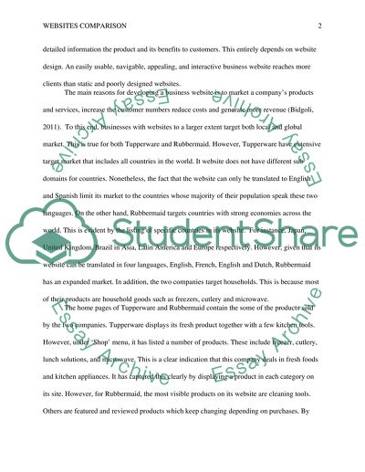
? Websites Comparison The growth in adoption of internet technology has grown tremendously, mainly due to the changing nature of our lifestyle and the changing face of the global economy mostly attributed to developments in technology. In today’s business environment, companies must brand their products, ship products on a global scale, and grow their customer base beyond international borders in order to generate impressive revenues. This has been made possible through online marketing and selling strategies that firms put in place to ensure they sustain their businesses in this competitive global marketplace. There are many business websites that are visible to billions of people across the world. Therefore, the ease at which a customer finds required information is very critical in online marketing. For this reason companies ought to give detailed information the product and its benefits to customers. This entirely depends on website design. An easily usable, navigable, appealing, and interactive business website reaches more clients than static and poorly designed websites. The main reasons for developing a business website is to market a company’s products and services, increase the customer numbers reduce costs and generate more revenue (Bidgoli, 2011). To this end, businesses with websites to a larger extent target both local and global market. This is true for both Tupperware and Rubbermaid. However, Tupperware have extensive target market that includes all countries in the world. It website does not have different sub domains for countries. Nonetheless, the fact that the website can only be translated to English and Spanish limit its market to the countries whose majority of their population speak these two languages. On the other hand, Rubbermaid targets countries with strong economies across the world. This is evident by the listing of specific countries in its website. For instance, Japan, United Kingdom, Brazil in Asia, Latin America and Europe respectively. However, given that its website can be translated in four languages, English, French, English and Dutch, Rubbermaid has an expanded market. In addition, the two companies target households. This is because most of their products are household goods such as freezers, cutlery and microwave. The home pages of Tupperware and Rubbermaid contain the some of the products sold by the two companies. Tupperware displays its fresh product together with a few kitchen tools. However, under ‘Shop’ menu, it has listed a number of products. These include freezer, cutlery, lunch solutions, and microwave. This is a clear indication that this company deals in fresh foods and kitchen appliances. It has captured this clearly by displaying a product in each category on its site. However, for Rubbermaid, the most visible products on its website are cleaning tools. Others are featured and reviewed products which keep changing depending on purchases. By making cleaning tools appear in hope page, the company is showing that these tools are its main products or they are the most popular brands. As such, they ought to be in the first page because they are most sought. The other products are found in ‘Shop Products’ where the products are displayed according to categories. On product comparison, Rubbermaid sells a variety of products ranging from house hold goods to commercial goods. Both Tupperware and Rubbermaid home pages do not give price details for any product. Meaning, a customer using price and product as search words would perhaps not see the two websites on the first page of search engine. However, under each product listed ‘Shop’ menu on Tupperware’s website there is a price attached to it. For instance, the price of freezer mate as displayed on the site is 29 dollars. By including prices, Tupperware, reduces clients decision making time since relevant information is availed. A client does not need to call or send inquiries before performing the purchase. Conversely, Rubbermaid does not provide prices of its products on the website. Perhaps, the company is protecting itself from price related competition. By not displaying the prices, the company leaves room for negotiation. However, this could turn disadvantageous if customers have more bargaining power. Moreover, price focused customers may find the site unhelpful. On promotion, the two companies have made great efforts to market their products on the website. The photographs of products used on the home page are appealing. One can easily identify the product and its use by simply observing the photograph. For example, on Tupperware site there is a food processor has been given meaning by fruits that have been put inside it. Again, Rubbermaid has a scrubber pressed against the tiled wall to market it. Tupperware also runs a promotion on salads where a client is expected to save 40%. There is also a link on the homepage that direct a customer to 25 products whose prices have been reduced. On the other hand, Rubbermaid uses marketing words such as two times faster, looses stubborn spots and refillable to market its products on the website. Besides, it has coupons and special offers on some of its products such as spray mop. Both companies use social networking sites to market and give information about their products. Proper website design features are paramount on the success of a business. A well designed website has in content and textual quality navigation capabilities. Tupperware compared to Rubbermaid, had faster load time, good picture quality and color considering the type of product being sold. Rubbermaid had security mark like Norton security, which proved to be trustworthy when it comes to giving sensitive credit card transactions. Navigation through web pages was made perfect in both websites, implemented through the drop down menus and flash as one would see the products used. In Rubbermaid, a customer based in Canada would have been directed to their country home page by just clicking Canada button, hence saving time. On the other hand, Tupperware succeeded in reaching its intended target since one can easily find the nearest point of product pick up. In both websites, there are search facilities for seeking additional information. This functionality enables one to look for more information when not convinced by what is given on the website (Pappas & Tepe, 2002). Rating on effectiveness on the scale 1 - 4 Usability Design features Content quality Navigation Reachability Tupperware 3 3 4 3 3 Rubbermaid 3 3 3 4 3 In conclusion, it is worth noting that both companies have potential of attracting new consumers due to incorporation online social media into their websites. However, both websites have no functionalities to support of mobile devices whose usage in business transactions is in steep rise. This puts a limitation on customers intending to make payments using mobile phones. References Bidgoli, H. (2011). MIS. Boston, MA: Course Technology Cengage Learning. Pappas, M., & Tepe, A. E. (2002). Pathways to knowledge and inquiry learning. Greenwood Village, Colo: Libraries Unlimited. Read More
Cite this document
  • APA
  • MLA
  • CHICAGO
(“Business Websites. Tupperware and Rubbermaid Web Site Comparison Assignment”, n.d.)
Business Websites. Tupperware and Rubbermaid Web Site Comparison Assignment. Retrieved from https://studentshare.org/marketing/1476948-web-site-comparison-project
(Business Websites. Tupperware and Rubbermaid Web Site Comparison Assignment)
Business Websites. Tupperware and Rubbermaid Web Site Comparison Assignment. https://studentshare.org/marketing/1476948-web-site-comparison-project.
“Business Websites. Tupperware and Rubbermaid Web Site Comparison Assignment”, n.d. https://studentshare.org/marketing/1476948-web-site-comparison-project.
  • Cited: 0 times

CHECK THESE SAMPLES OF Business Websites. Tupperware and Rubbermaid Web Site Comparison

Web Sites of the Gulf Cooperation Council and Egovernment Website

5 Pages (1250 words) Research Paper

Web Site Evaluation

The paper "web site Evaluation" says at first glance, there is absolutely no clue that the website deals with automobile audio systems and other accessories.... This site would hardly be picked up by search engines if someone is looking for something as specific as 'car audio systems in Lancashire'.... Though underlining of the hyperlinks is not necessary as they are placed in the conventional left-hand navigation bar, the font and colour of the hyperlinks are exactly the same as other text used in the site resulting in the impression that the address of the firm are also hyperlinks....
7 Pages (1750 words) Term Paper

Website Comparison Paper

However, the legibility factor is closely related to age group and various age groups may assess the the legibility differently as Fukuda & Heiner (2011) observers, “With regard to the comparison between the two age groups, the evaluation of legibility by elderly people could be worse than the evaluation by younger people because elderly people required longer fixation and more eye movements to find the target navigational button.... Eye tracking study on Web-use:comparison between younger and elderly usersin case of search task with electronic timetable service....
2 Pages (500 words) Admission/Application Essay

Discussion Question

Schmitt is an example of a leader who thinks that he has all the Discussion Question Discussion Question The company that will be discussed in this essay is rubbermaid, specifically during the time when it was under the helm of CEO, Wolfgang Schmitt.... Foremost among the factors mentioned about rubbermaid's failure is the decision-making style of Schmitt.... Michael Hamilton, a portfolio manager at Invista Capital Management stated that rubbermaid “lost control of the brand and expenses” (Kapner, 1998)....
1 Pages (250 words) Assignment

Web Site Development Process

The present assignment entitled "web site Development Process" deals with the Internet's advantages.... This research-based report is about the detailed analysis of the web-based system development.... In this research, I will present a deep insight into some main areas of the web-based systems development.... They can be regarding the web planning, design, construction, and evaluation.... The main aim of this research is to present a deep insight into the web-based systems development technologies and theories....
9 Pages (2250 words) Assignment

A Comparison between the Number of Web Sites of the GCC, its Services, and E-government Website

The basic purpose of this comparison is to determine the needs and requirements that are necessary to know for building an effective and informative web site.... In this scenario, the Hukoomi offers a good national overview; however, at this web site comprehensive national overview is missing.... As this web site is aimed at presenting a detailed overview of the country so it needs to offer a brief but comprehensive overview of the State of Qatar....
16 Pages (4000 words) Report

Comparisons between Tourism Websites

hellip; The site lacks the impressive features that such a tourism attraction website should have to as to ensure as many visitors as possible, hence, much need to be done on it still n terms of beautification and information precision.... "Comparisons between Tourism websites" paper compares the Dubai Department of Tourism and Commerce Marketing Website and states that they are quite well balanced....
6 Pages (1500 words) Term Paper

Comparing Websites of Universities: Brunel University, Royal Holloway and the University of Reading

A comparison of the websites of three universities i.... The site also lacked internal consistency since the drop down menus which come up on the homepage; do not reveal themselves as the user goes deeper into the website.... Brunel University, Royal Holloway and the University of Reading is made to show what positives and negatives could be gathered from the websites considering the notions of information architecture, information organisation and interaction design....
6 Pages (1500 words) Article
sponsored ads
We use cookies to create the best experience for you. Keep on browsing if you are OK with that, or find out how to manage cookies.
Contact Us