StudentShare
Contact Us
Sign In / Sign Up for FREE
Search
Go to advanced search...
Free

Evaluation of Website Interface Re-Design 5 - Research Paper Example

Cite this document
Summary
The paper "Evaluation of Website Interface Re-Design 5" asserts Both heuristic and user-centered design evaluations for the Nebula Web interface had their unique advantages and disadvantages. in particular, the success of its outcome depends on the experience of whoever is conducting the evaluation…
Download full paper File format: .doc, available for editing
GRAB THE BEST PAPER91.4% of users find it useful
Evaluation of Website Interface Re-Design 5
Read Text Preview

Extract of sample "Evaluation of Website Interface Re-Design 5"

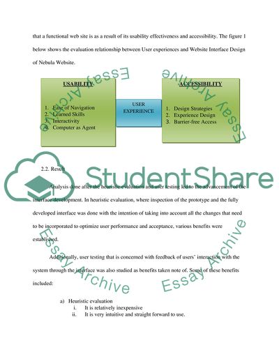
1. Raw data from Evaluation Execution (2pgs) This comprehensive data was sourced primarily from various Academic resources such as materials on HumanFactors in Testing and Evaluating Web interfaces. Other sources of information included interviews conducted to obtain useful feedbacks on the heuristic design evaluation and user-centered design evaluation. A summary of the interview results is in the table below for greater comparisons of the two principles applied. Heuristic Design Evaluation User-Centered Design Evaluation Advantages Disadvantages Advantages Disadvantages Considerably cheap and faster Represents to a low extent the targeted user population Represents to a larger extent the targeted user population At times it is time consuming The higher the number of evaluators the more potential problems are realized in the interface Few number of evaluators result into less problems found with the interface. High number of users mean more problems are discovered on the interface Less users signifies less hitches discovered with the interface. It can be implemented in the early stages of design process of the interface Hitches identified relies on if an expert or not evaluates the interface It can be implemented a number of times throughout the design phase of the interface. Conveying a problem to the evaluator may be difficult for the user of the interface during evaluation 2. Evaluation with user report (4pgs) 2.1. Evaluation Executive Details Any website’s success is to a larger extent associated with its navigation (which includes organization, layout, arrangement and sequencing of web properties), content, interactivity and its responsiveness (feedback options together with FAQs) (Palmer, 2002). It is a point to note that a functional web site is as a result of its usability effectiveness and accessibility. The figure 1 below shows the evaluation relationship between User experiences and Website Interface Design of Nebula Website. 2.2. Result Analysis done after the heuristic evaluation and user testing led to the advancement of the interface development. In heuristic evaluation, where inspection of the prototype and the fully developed interface was done with the intention of taking into account all the changes that need to be incorporated to optimize user performance and acceptance, various benefits were established. Additionally, user testing that is concerned with feedback of users’ interaction with the system through the interface was also studied as benefits taken note of. Some of these benefits included: a) Heuristic evaluation i. It is relatively inexpensive ii. It is very intuitive and straight forward to use. iii. It can be implemented in the early stages of system development process and its “test-retest” spin time is quicker. b) User Testing i. It is very appropriate during system assessment to identify problems that users are likely to experience while performing their real tasks (Doubleday et. al, 2009). ii. It helps detect potential hitches quickly so as to enable for appropriate actions before the Website is hosted for use. 2.3. Conclusion Both heuristic and user-centered designs evaluations for this Nebula Web interface had their unique advantages and disadvantages. For the heuristic design evaluation, the success of its outcome is largely dependable on the experience of whoever is conducting the evaluation; the number of interface evaluators; and the number of users evaluated so as to reach a define conclusion. Under user-centered design evaluation, test group size determines the level of success of the end result. 3. Recommendations (3pgs) 3.1. Qualities of the interface i. Concise Simple and short illustrations give underneath each category of available furniture i.e. Shopping Living Room, Shopping Bedroom, Shopping Dining Room and Shopping Lightening are quite okay as they provide brief but complete information as may be needed by those who want to shop for any item under those categories. ii. Clear Graphical User Interface used enables for effective interaction between the system, users and system administrators by communicating meaning and functions. iii. Responsive Based on HTML and CSS for its development, Nebula WebPages are fast to open, the interfaces provide feedbacks i.e. “Loading” or “Please wait” notifications. iv. Familiar This website interface is naturally and instinctively understandable and comprehensive. All online shoppers have the expectations of getting the best as per their requirements on the e-commerce websites. Nebula is not an exceptional as it all these into account. v. Attractive Nebula web interface is quite enjoyable, meaning it is attractive. Such attractive interfaces not only make one to use it but also to look forward to using it again and again. The look and feel of this website interface is fashioned to fulfill aesthetics and for the targeted audience. vi. Efficient Website efficiency in about trying to establish a user’s requirements and letting them achieve it without any fuss. Nebula website, an e-commerce website, aims at providing house hold facilities of varied designs and prices so as to meet the needs of all its clients. Additionally, navigation option is also included in the website to facilitate viewing, comparing and selection of available facilities as one would do for a window shopping. vii. Forgiving Web site designs and developments come with little mistakes that might have not been noticed during the evaluation process of the system. However, how well the system or website can handle these mistakes is an indication of the software/ website quality. In the development of Nebula website, users are never punished since the interface if forgiving and functionalities made editable. Forgiving graphical user interfaces (such as Nebula Website) saves users from costly mistakes through retrieval/ undo options if any information is deleted by mistakes. 3.1.1. Parts of the design that works well User and administration evaluation demonstrated positive results in relation to the flexibility, usability, security, efficiency, dependability and effectiveness of the system. With all these characteristics of a good website approved as effective, it is true to conclude that all parts of this design work well. 3.1.2. Parts that need improvement All the components of the design are impressive as they meet both the organization’s and customers’ requirements. However consistency should be ensured more so, based on the background color since such differences may make one to think that he/she has been directed to another website of Nebula company. Consequently, maximum contrast should be ensured between the background colors and the illustrative-text-color i.e. black background color on the homepage and grey color for the texts do not have maximum contrast to allow for proper readability. 3.2. What the result mean in terms of interface validation and next logical design step Approved design interface for the e-commerce purposes is an indication of the achievement of the purpose for which this website (Nebula) was setup. As an e-commerce interface, the site has to be very attractive, in the first place, and thereafter be able to meet the requirements of both the institution that set it up and the targeted user market/ population. Based on this initial interface, the sequential logical design step should work at enhancing qualities of user requirements in relation to their expectations out of the website. 4. Reflection (3pgs) 4.1. Lesson about user-centered design process User-centered design (UCD) is a design process whereby the end-users’ requirements, expectations and contributions are used to influence how any design takes shape. User-centered designs are necessary during requirements gathering and usability testing, and system interface designing. According to Eason (1987) there are three types of users: primary users (those who will actually use this Website), secondary users (who who intend to use this Website occasionally or use it through intermediaries), and tertiary users (those who become affected by the use of this website). Usability testing (under UCD) aims at achieving the goals of improving website usability; involving real users in the testing; allowing users into real tasks of accomplishing website requirements; enabling testers to observe and keep records of actions of participants; and allowing testers to analyze data all data obtained and update them accordingly (Dumas & Redish, 1993). It focuses on uses empirical measurements, user needs, and interactive design. Interviews and focus groups are the most frequent methods used in the evaluation process as they provide valuable information as to the user satisfaction and problems of the functionality. Advantages of User-Centered Design i. It aids an inner understanding of the organizational, social, ergonomic and psychological factors affecting the utilization of computer technology that materializes from participation of users in each and every stage of designing and evaluating the website. ii. It enables designers to manage users’ expectations of any new products, in this case Nebula e-commerce website and its products. This fact creates a feeling of ownership for the end product, often resulting in high consumer satisfaction and better integration of the product into an environment (Preece, et al, 1994; Preece, et. Al, 2002). Disadvantages of User-Centered Design i. It is at times costly ii. It takes long to gather recommended information from and about users i.e. when there is need to understand the environment within which products will be used. iii. Some ambiguity/ complications may at times be experienced in translating some data types into design. iv. This exercise may involve additional design team members and a variety of stakeholders. 4.2. Success of the evaluation and prototyping chosen Heuristics evaluation criteria was applied in this case study evaluation and it included visibility of the system status; any user control and freedoms; consistency between system and real world; error prevention techniques; recognition rather than recall; flexibility and efficiency in the use; aesthetic and minimalist of design; error recovery options; and help/ guidance documentation. 1. Error prevention The prototype has taken into account measures that will help to prevent errors. Options provided are the Heuristic of error preventions and “Go back, Skip and Delete” on the page of items’ selection or ordering (picture 8). 1.1. Visibility of the System Status Because of too much graphics/ pictures (which is a plus to the Nebula Website since it needs to display its products) a significant amount of time will be taken to load depending on connectivity wherever a user is. This may inconvenience an impatient visitor, hence not achieving his/her goals in visiting the site. 1.2. Recognition Rather than Recall This system provides quick/ direct links, through the use of the five circle-shaped buttons (picture 1) which are distinctively plotted on the home page of the Web-site, to other pages. If the user decides not to link directly to the pages as predesigned by the developer, possibility of going through other “unnecessary to the user” pages is quite high. This therefore restricts the user to fully rely/ be in the developers’ shoes for efficiency. 1.3. Flexibility and Efficiency For this particular concern, the developer had a deeper view by providing accelerators and quick links which are in most cases used by experts for reasonably faster navigations. A user, therefore, has the options to select best criteria to reach the desired page. Flexibility and efficiency are dressed by the use of drop-down menu and five circle-shaped colored buttons on the home page. 1.4. Visibility of the System Status Current location of the use is never indicated to the users throughout the site. Only experienced users can determine their positions through the use of abstract background images and titles of existing submenus. 1.5. Consistency and Standards Some pages are identified to have formats that differ from the general design of the home page. This interferes with the level of authenticity that a user may grant the whole site. Page design consistencies and standards allow users to feel comfortable and easy in moving from one page to the other. For example, home page (page 1) and page twelve (12) compared. Medium-fidelity Prototypes Make possible detailed information gathering. Prototypes generally forms a common platform where information a sample of all intended system users such as end users, client team members, and development team members come up with a common understanding of what should/ shouldn’t be included in the final product for an effective system / website. Such information gathered also illustrates how such advancements should be done. For instance, our case study requires that; upon implementation, the system administrator should ensure continuous links update for viability to increase user confidence and do away with imaginary execution. System support iterative development. Prototype revisions and continuous user testing outcomes can equally advance iterative development processes. Through this means, system applications/ websites can be refined in terms of functionalities, design, text/writings, flexibility, usability and applicability. In every design work, participatory designs are considered the best. As had been illustrated in the above points, prototypes are always simple in their nature of design, and considerably cheaper to implement and alter so as to suit the recommended changes. Prototypes’ evaluations provide grounds for realizing, citing, analyzing and taking necessary steps to curd the identified loopholes in the prototype. An already developed and rectified prototype qualify to be blueprints that can be used by many designing and developing teams to determine user requirements, for example. 4.3. Why prototype method and the evaluation method chosen were valuable. The extent to which the prototype and evaluation methods chosen were considered valuable was by determining the level of users’ satisfaction in using the interface; acceptance of the interface in the market; how fairly the interface competes in the local market as compared to other interfaces of related products; how satisfied is the business itself in using the interface; and finally seeing into it that the system can allow for its expansion in case of business growth. Works Cited Gould, J. D., & Lewis, C. (1985). Designing for usability: Key principles and what designers think. Communications of the ACM, 28(3), 300-311. Lazar, J. (2001). User-centered Web development. Boston: Jones and Bartlett Computer Science. Mayhew, D. J. (1999). The usability engineering lifecycle. San Francisco, CA.: Morgan Kaufmann Publishers, Inc. Preece, J.; Rogers, Y., & Sharp, H. (2002) Interaction design: Beyond human-computer interaction. New York: John Wiley & Sons, Inc. Preece, J.; Rogers, Y., & Sharp, H. (2002) Interaction design: Beyond human-computer interaction. New York: John Wiley & Sons, Inc. Preece, J., Rogers, Y., Sharp, H., Benyon, D., Holland, S. & Carey, T. (1994) Human-Computer Interaction. Essex, England: Addison-Wesley Longman Limited. Read More
Cite this document
  • APA
  • MLA
  • CHICAGO
(Evaluation of Website Interface Re-Design 5 Research Paper Example | Topics and Well Written Essays - 2000 words, n.d.)
Evaluation of Website Interface Re-Design 5 Research Paper Example | Topics and Well Written Essays - 2000 words. https://studentshare.org/information-technology/1787722-website-interface-re-design-5-evaluation-execution-recommendation
(Evaluation of Website Interface Re-Design 5 Research Paper Example | Topics and Well Written Essays - 2000 Words)
Evaluation of Website Interface Re-Design 5 Research Paper Example | Topics and Well Written Essays - 2000 Words. https://studentshare.org/information-technology/1787722-website-interface-re-design-5-evaluation-execution-recommendation.
“Evaluation of Website Interface Re-Design 5 Research Paper Example | Topics and Well Written Essays - 2000 Words”. https://studentshare.org/information-technology/1787722-website-interface-re-design-5-evaluation-execution-recommendation.
  • Cited: 0 times

CHECK THESE SAMPLES OF Evaluation of Website Interface Re-Design 5

Usability and Human Factor Studies of Technology

A preferred interface for senior citizens would be a Graphical User interface (GUI).... Nielsen's principles have made it easier to make a user-friendly website, as such once the heuristics are followed, most problems will be eliminated.... The web usability principles created by Jakob Nielsen helps to create a user-friendly website for both experienced and inexperienced users.... This principle provides an advantage for senior citizens as it minimizes the user's memory load, making the website more sensitive to their needs....
1 Pages (250 words) Assignment

The User Experience Design Document

This would enable the proper evaluation of the functional website against the competing websites.... Since websites evolve after they come into execution and also with the passage of time, it is essential that a periodic evaluation of the competing websites should be conducted.... The User Experience design document would formally be divided into a mentioning of the users that would interact with the website, an account of the possible scenarios that would incur if and when each type of user would interact with the web portal and finally a comparative… Seeking a user experience before making a website is inevitable since it results in the formulation of an unambiguous and properly documented definition of audience....
2 Pages (500 words) Essay

Team assignment

The Berry's website designer has modelled an easy website interface with crucial Berrys Bug Blaster Web Evaluation Berrys Bug Blaster Web Evaluation Information technology is one of the most advancing fields in our society of which nowadays you cannot do anything without its application.... The Berry's website designer has modelled an easy website interface with crucial operation to some scope in a modelled manner.... Nevertheless, the paper illustrates the proposals on how Berry may develop and improve a number of website factors to reach the focused audience, build visitors' trust, as well as clients alongside seeking guidance to raise the web traffic....
2 Pages (500 words) Essay

Associations of Identity Through the Website, LaCie

Creating a stronger brand identity, and set of website functions will help to enhance the product as well as the customer relationships that are related to the business.... This essay discusses building a brand identity through an online portal which includes different elements that will provide customers with a deeper understanding of the website.... When looking at the website, LaCie, it can be seen that there are several areas of improvement....
13 Pages (3250 words) Essay

Web Development for Information Management

Although the required functionality is simple, yet the user interface of the site and its functionality determines a major part of the customer's experience with the company.... Sound Presentation: The overall interface and outlook of the website shall be determined.... The aim of the work is to design a working prototype of an online pizza ordering and delivery website, especially to develop order online, a customer account.... The website provides a listing of the pizzas and side orders on the menu from which a customer can select the items....
9 Pages (2250 words) Case Study

Interaction and Usability, Insurance Sales Tracking

From the paper "Interaction and Usability, Insurance Sales Tracking " it is clear that Sales movement can be measured and used to enable an individual or account to interact with a given interface of the system.... Each sale level can have a different interface....
5 Pages (1250 words) Essay

Use of Information Technology in Theater

Users, therefore, need a website that will enable them to purchase the tickets online and avoid the inconveniences of queuing.... The need for agents will be eliminated as the customers will be able to purchase their tickets directly from the website of the theater.... This group of persona will also be comfortable with the use purchase of tickets through the website....
6 Pages (1500 words) Assignment

Software Development Project - Fitness First Centre Online Management System

website Template, Home page Completed The Home page was designed and also the project structure.... The author of the paper "Software Development Project - Fitness First Centre Online Management System" states that the new system will incorporate the old functions only that the services will be online, where members can book any session and purchase the desired program at anyplace anytime....
7 Pages (1750 words) Case Study
sponsored ads
We use cookies to create the best experience for you. Keep on browsing if you are OK with that, or find out how to manage cookies.
Contact Us